- April 16, 2021
- Posted by: Shadrack Adwera
- Category: Microsoft, SharePoint, SharePoint Framework

It was a fine Friday afternoon, and our Communication Site was working quite well, all the moving parts connected devoid of any bugs as they had been all week. Everything was perfect – the code DRY (Do not Repeat Yourself), components lean, even the look and feel of the application was everything we had hoped for. All that was left was to inform the client of the progress made.
We were at all systems go, ready for launch in T-minus 3….2….1. Not expecting anything bad to happen but come Monday the following week … this certain web part had been squeezed to the center of the page.
An example of the bug on a different project. How it started:
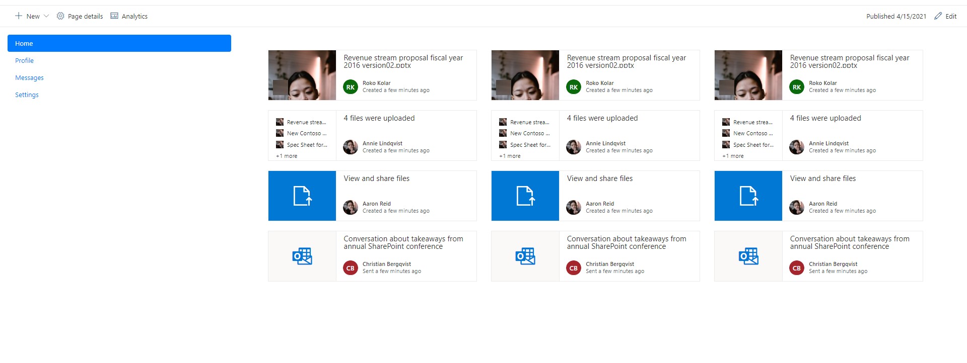
Vs
How it was going:
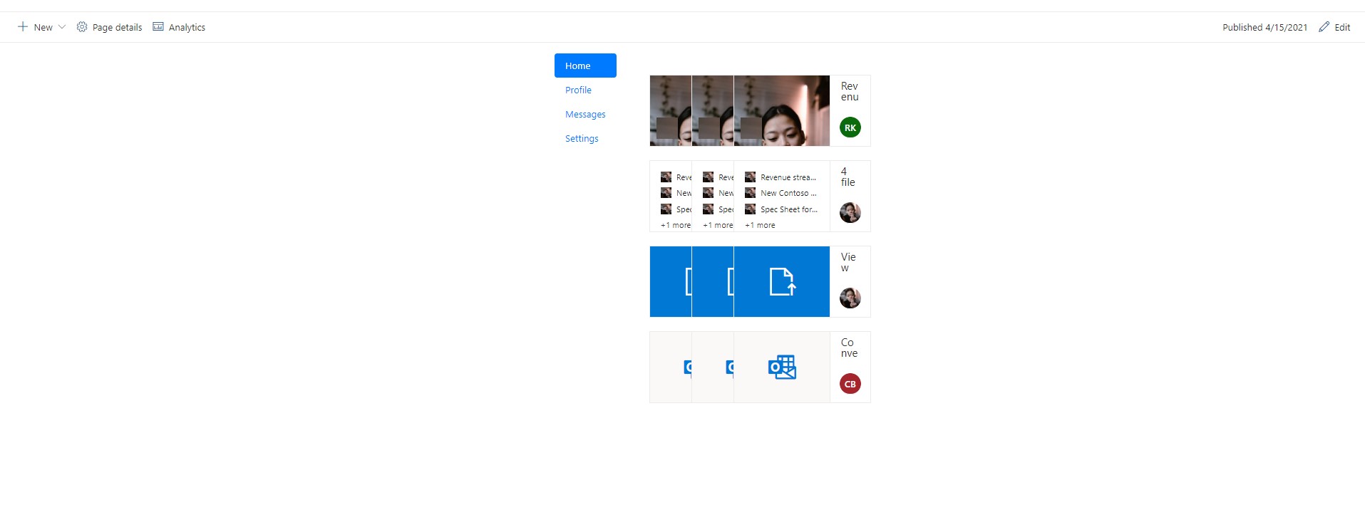
…. this issue happened AGAIN, then AGAIN and AGAIN. Then all of a sudden all our customized web parts had this bug.
It was really scary and quite confusing considering the code had not been updated anywhere between Friday and Monday.
A Temporary Solution
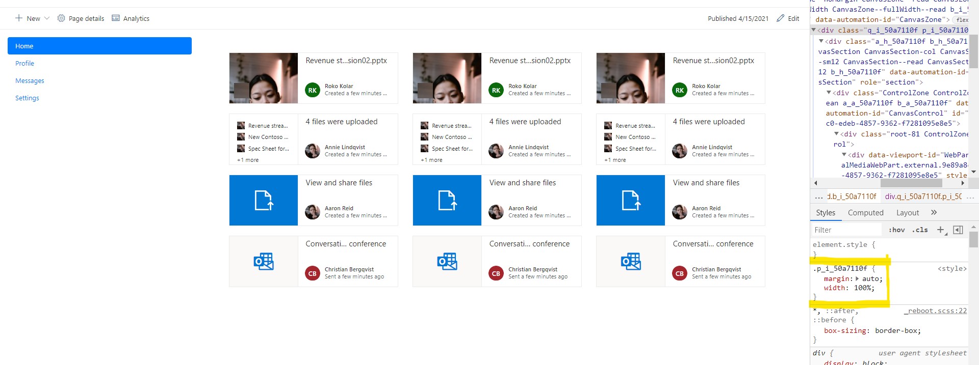
We started out by inspecting the web part on the browser dev tools. This certain SharePoint class was missing a certain CSS property. A property that once added, solved all our problems.
At that time, the SharePoint CSS class was called .p_i_50a7110f and the CSS property was margin:100%. A simple enough solution.
Overwriting this class via the code such that when the page loads, the browser loads this manually targeted class together with the web part sounded like the complete hack and it actually was, until a week later… we were back to square one. The bug re-appeared again. We did this process once more (inspecting the web part) and to our surprise, the SharePoint CSS class name had changed. A week later, the name changes, then changes again and again and again. Now, this has become the norm every week.
This solution was simply not going to stick.
The Explanation
On the weekend when the bug was first identified, Microsoft had run an update to SharePoint Online which had added a class called row. This class is applied to all sections of the page holding the web parts, either fullwidth, one width column, you name them all.
We had used Bootstrap on all our web parts to make them mobile responsive. The second layer of class after the container is the bootstrap row. So, what happens is that the page loads with its default class named row then on comes bootstrap with the same class which overwrites the configuration of the SharePoint row. The default configuration for bootstrap’s row for the display is flex. A flex container expands items to fill available free space or shrinks them to prevent overflow.
And Voila! The reason for the squeezed web parts to the center of the page.
The Solution
- Avoid using Bootstrap in SPFx web parts. There are other frameworks that work quite well majorly the default Fluent UI (Recommended for SharePoint), material-ui react also works well but the look and feel may change, SASS, Tailwind CSS, amongst others.
- In the case that Bootstrap must and shall be used, avoid the use of container, row, and column classes and instead use media queries for responsiveness, or rather the inbuilt components from the CSS frameworks, ( Stack for Fluent Ui and Grid for material-ui).
Best view i have ever seen !